Corporate Brand Identity for Coffee Brands: What It Really Is (and Why Mastabah Coffee Built a Full Brand System)
Most coffee brands don’t lose customers because their beans aren’t good.
They lose customers because the brand experience feels inconsistent:
- the Instagram looks premium, but the packaging looks generic
- the café menu feels “one style,” but the posters feel like “another brand”
- the logo is used differently by every designer, printer, or staff member
- the brand tone changes depending on who writes the caption
That inconsistency is expensive—because it erodes trust.
And that’s exactly why we built a Corporate Brand Identity + Brand Guidelines system for Mastabah Coffee: not just a “nice brand book,” but a scalable set of rules and assets that make the brand look premium in real life—everywhere it appears.
Brand consistency is widely tied to trust across touchpoints and is repeatedly highlighted by practitioners and industry research as a commercial driver, not a “design detail.”
What “Corporate Brand Identity” Means for a Coffee Brand
A corporate identity is not a logo.
It’s a decision system that answers:
- What do we look like—every time?
- How do we speak—every time?
- How do we package, label, and present the product—every time?
- How do we stay premium when five different people execute the brand?
Coffee brands need this even more because the customer journey is fragmented:
- discovery on social
- decision on packaging (freshness, roast date, origin, notes)
- loyalty through repeat rituals (and repeat exposure)
If any one piece feels “off,” the brand doesn’t feel premium—even if the coffee is. Packaging and freshness cues are part of that trust loop, and the specialty industry keeps pushing better packaging and freshness standards for a reason.
Case Study of Our Work: The Mastabah Coffee
Brand Story: Why your coffee exists (beyond “we sell coffee”)
Why it matters:
A brand story is a positioning tool. In coffee, customers don’t just buy caffeine—they buy identity, ritual, taste culture, and values.
Real-world scenario:
Two brands sell similar beans. The one with a clearer story wins wholesale pitches, partnerships, and repeat loyalty because buyers can explain it to others.
Mastabah approach:
We shaped Mastabah as calm premium—specialty coffee presented with restraint, not noise. That becomes the filter for every design and message.
Values: The “invisible guardrails” that stop brand drift
Why it matters:
Values aren’t poster text—they help you decide what to do when the brand scales:
- new product line
- new designer
- new café staff
- new marketing manager
Real-world scenario:
A seasonal campaign is rushed. Without values, content becomes louder, clickbait-ish, off-brand. With values, the brand stays recognizable even under pressure.
Logo System: Your signature, not a sticker
Why it matters:
In premium categories, sloppy logo usage instantly reduces perceived quality. Consistency is the difference between “crafted brand” and “small business trying things.”
What we locked down:
- primary logo usage

- alternate versions for small applications
- controlled placement behavior
Safe Zone (Clear Space): The simplest premium move nobody respects
Why it matters:
Clear space is not “extra empty space.” It’s visual authority. It protects legibility and makes the mark feel intentional—especially on crowded packaging and social posts.
This is a widely repeated best practice across brand guideline systems.
Real-world scenario:
A printer centers the logo too close to the edge; a freelancer places text too close to the mark. The result looks cheap. Safe zones prevent that.
Logo Misuse: Preventing accidental damage by “helpful edits”
Why it matters:
Most logo damage is not malicious—it’s convenience:
- stretching to fit a template
- adding outlines for “visibility”
- changing colors to match a background
So we document “don’ts” clearly—because the brand will be executed by many hands over time.
Color Palette: Recognition at speed
Why it matters:
Color is one of the fastest brand recognition triggers—especially in social feeds and shelf environments. (Even when customers don’t remember the name, they remember the feel.)
Mastabah approach:
We anchored Mastabah in a grounded, specialty-coded palette:
- deep green (confidence, calm premium)
- warm brown (coffee honesty, craft)
- soft cream (breathing space)
- gold accent (premium moments only—so it stays special)
Real-world scenario:
A café poster and an Instagram post should feel like siblings, not strangers. Color systems make that happen.
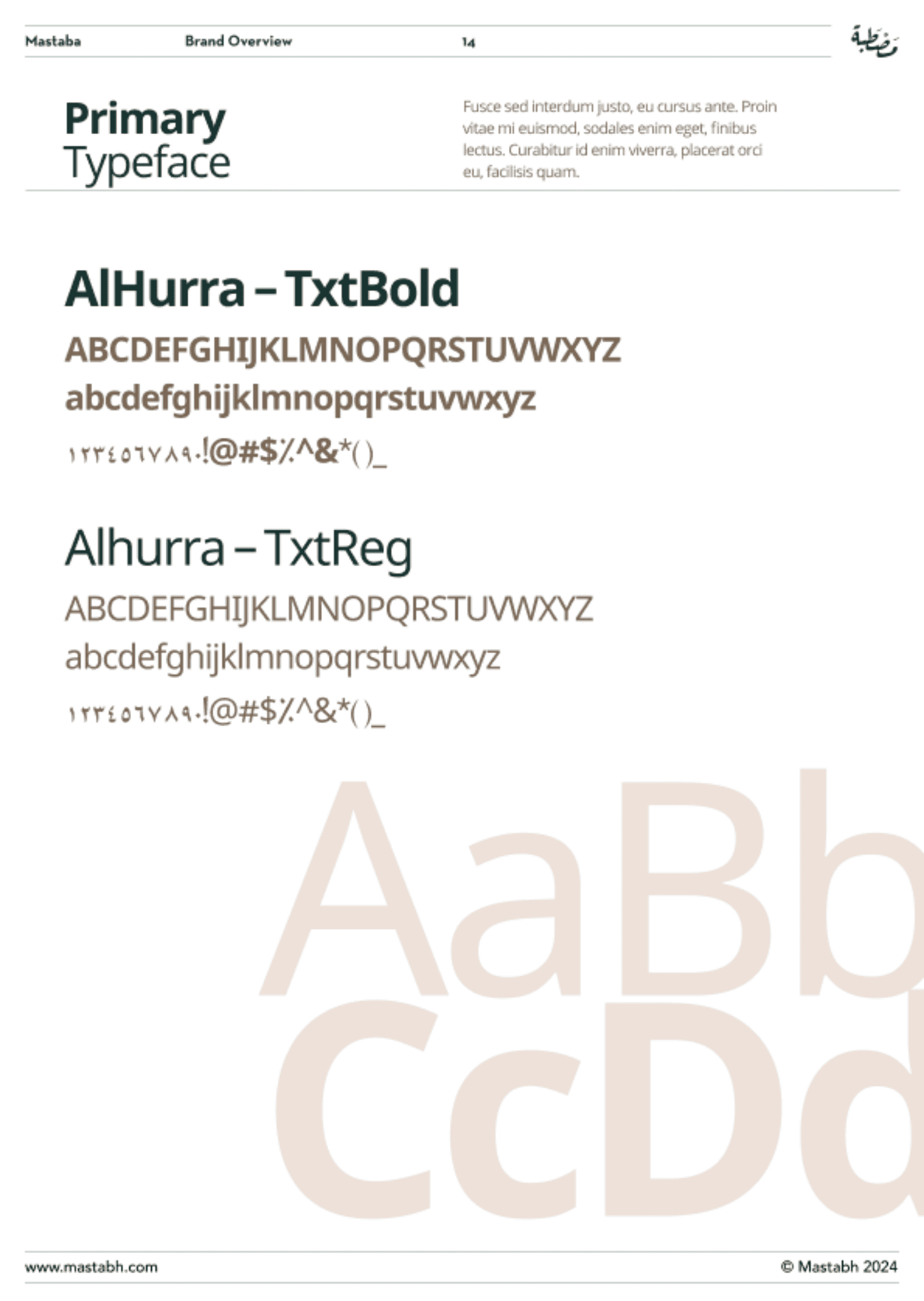
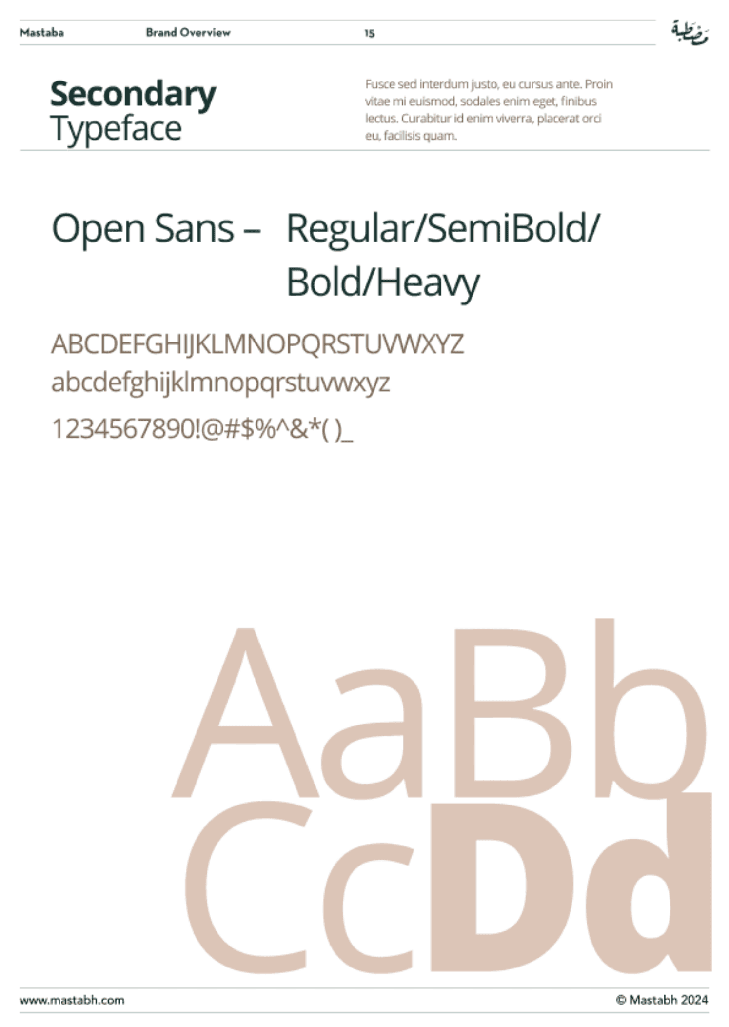
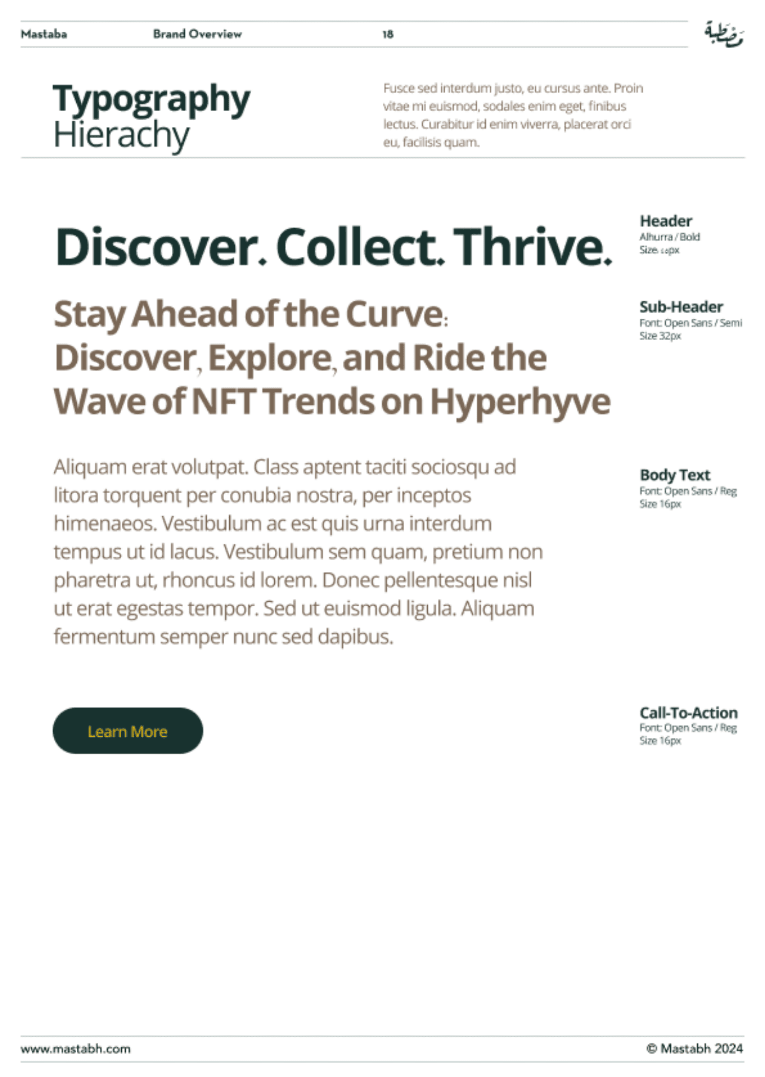
Why it matters:
Typography is how your brand speaks visually—before anyone reads the words. It impacts:
- readability
- perceived quality
- consistency across print/digital
Typography is consistently cited as a key brand identity driver because it shapes recognition and professionalism.
Mastabah approach:
We built a hierarchy that stays clean and minimal:
- strong headlines
- structured supporting text
- readable body copy for packaging details and menus
Real-world scenario:
If your menu typography feels “cheap,” customers subconsciously downgrade your product—even if the beans are excellent.
Voice & Tone: Consistency people feel

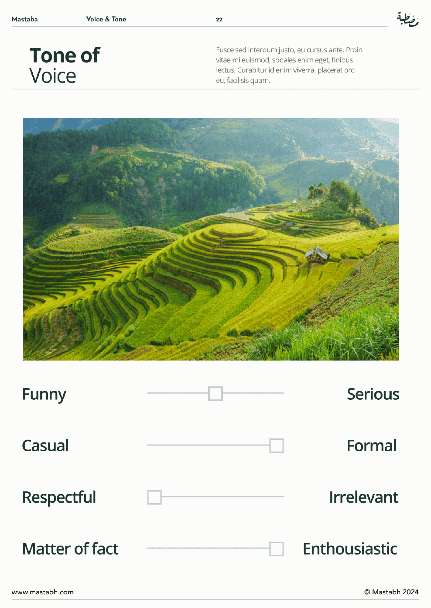
Why it matters:
A brand isn’t only recognized by visuals. Tone is recognition too—especially in captions, customer service replies, menu descriptions, and product notes.
Consistent messaging and tone are repeatedly linked to trust and expectation-setting across touchpoints.
Mastabah approach:
Calm. Knowledgeable. Minimal. No hype.
This is how premium specialty brands win: they don’t shout—they reassure.
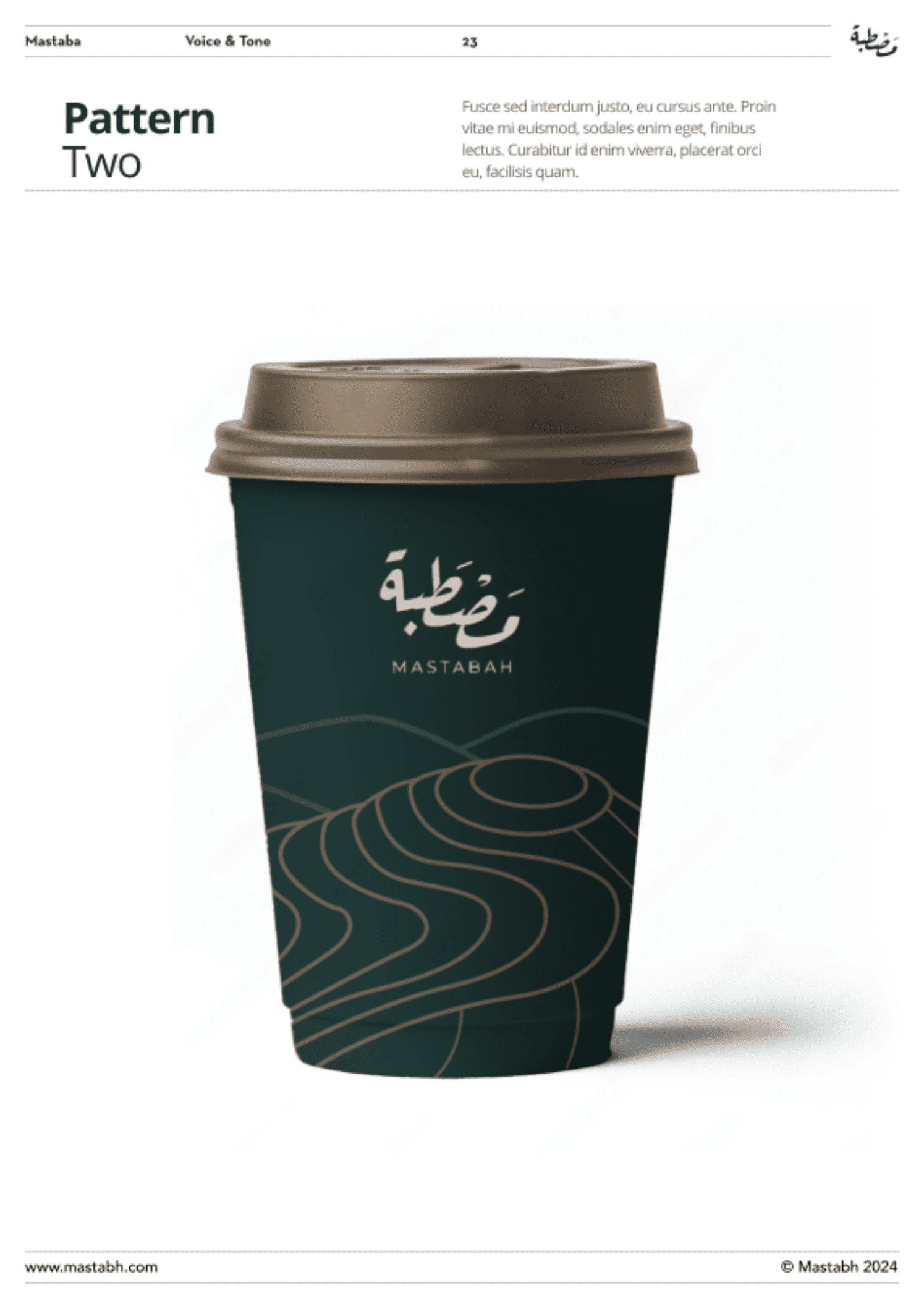
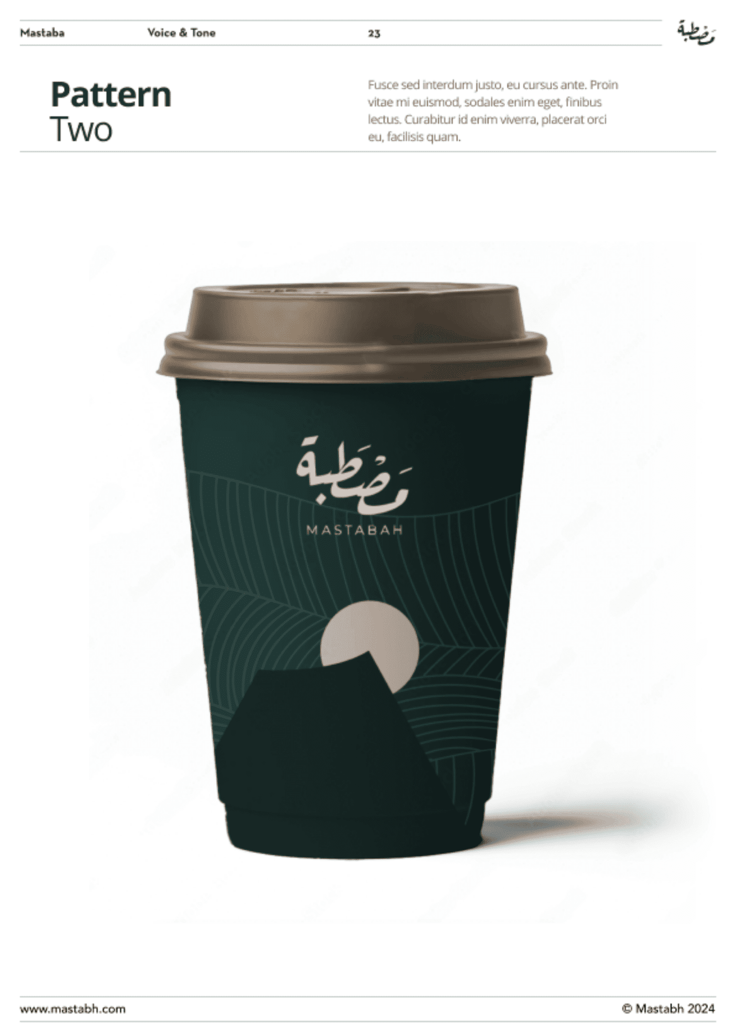
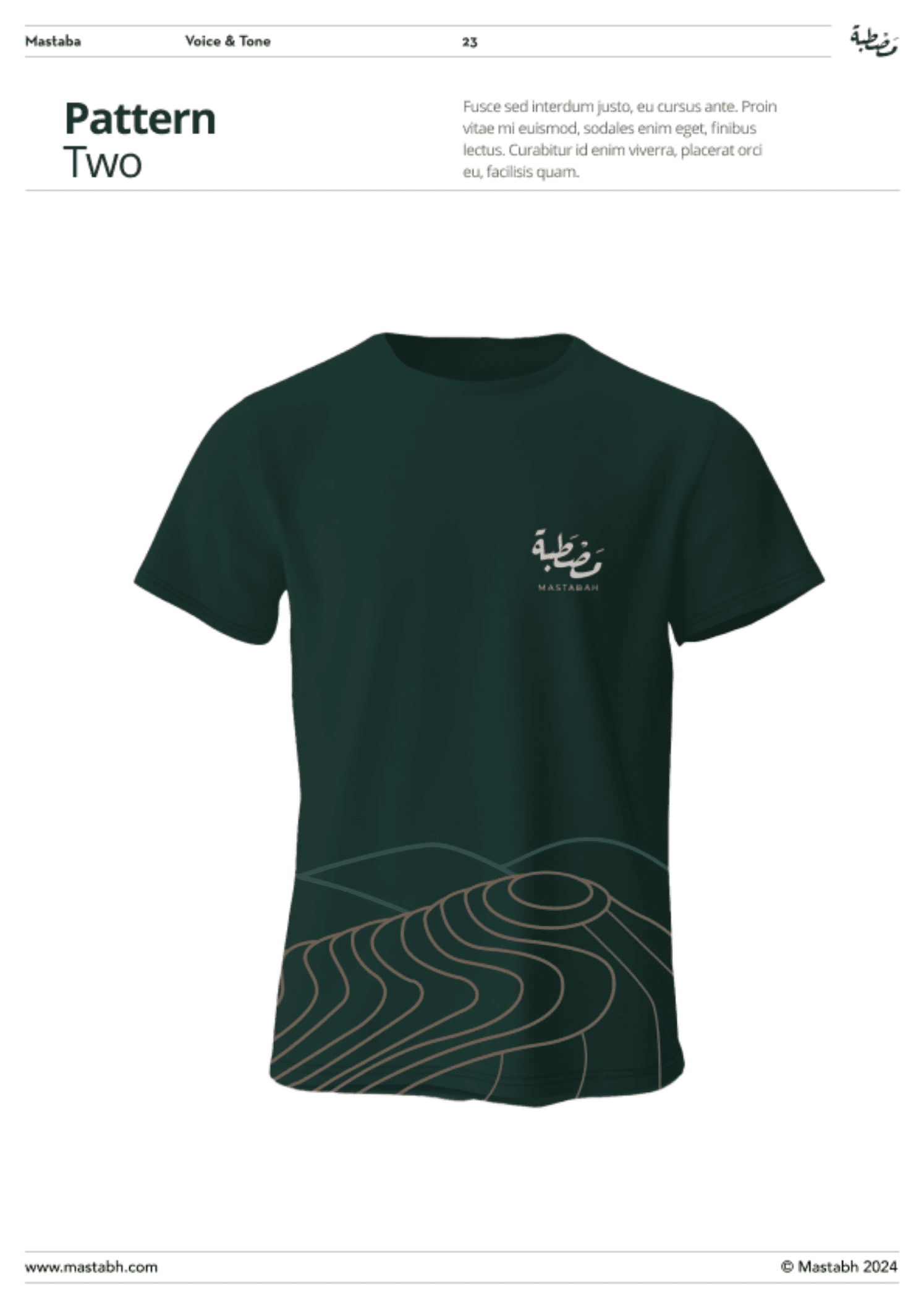
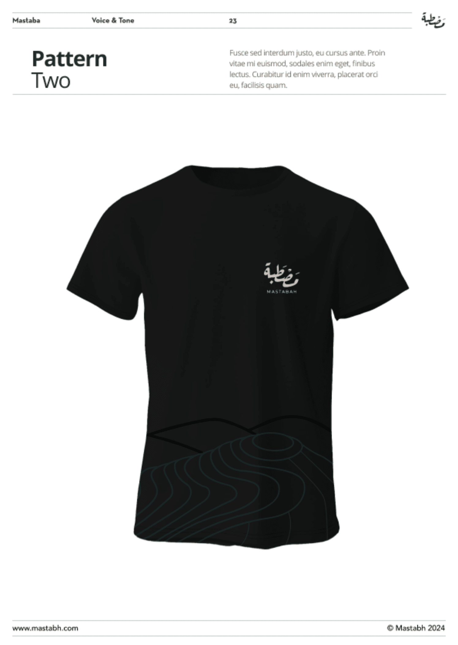
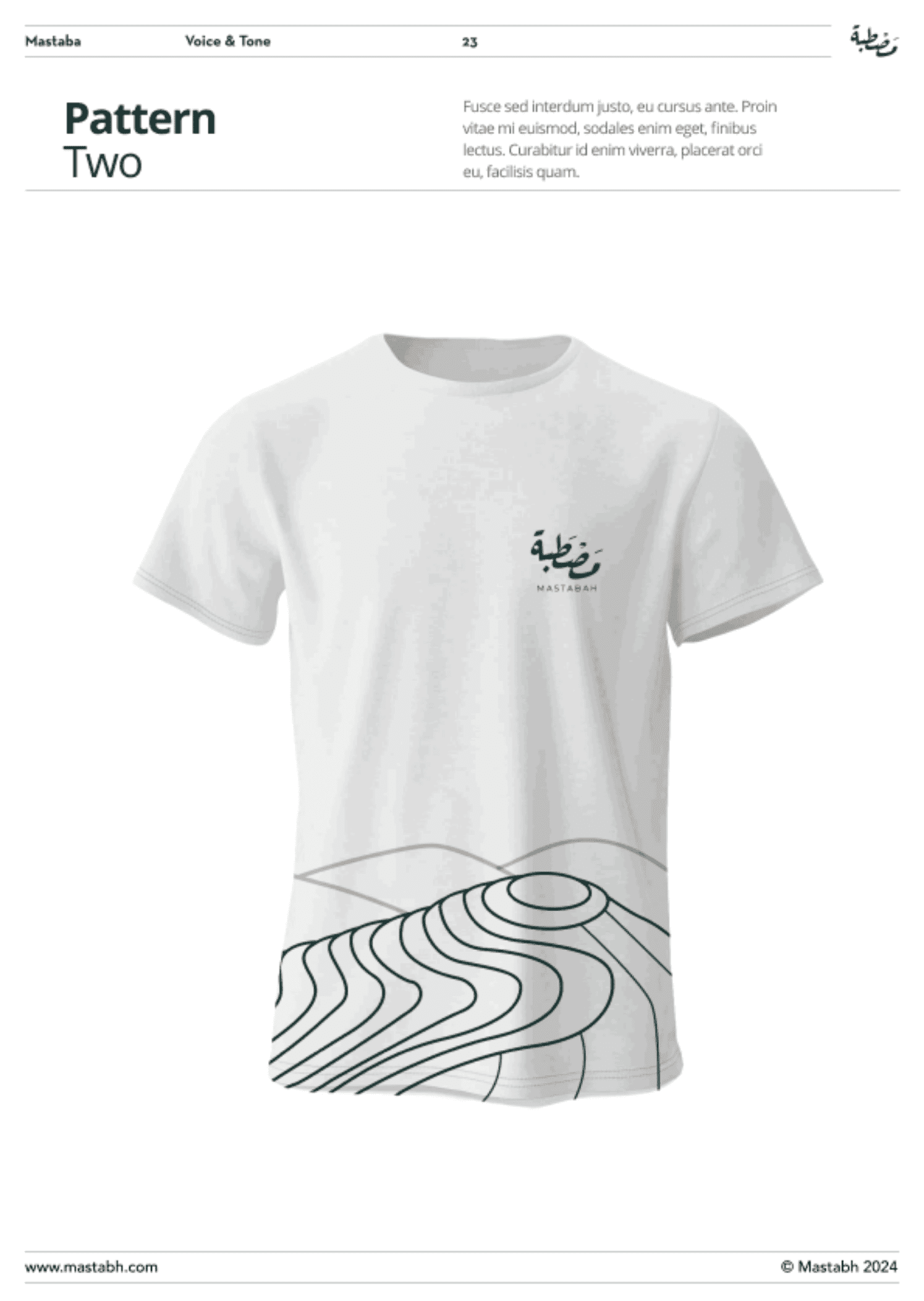
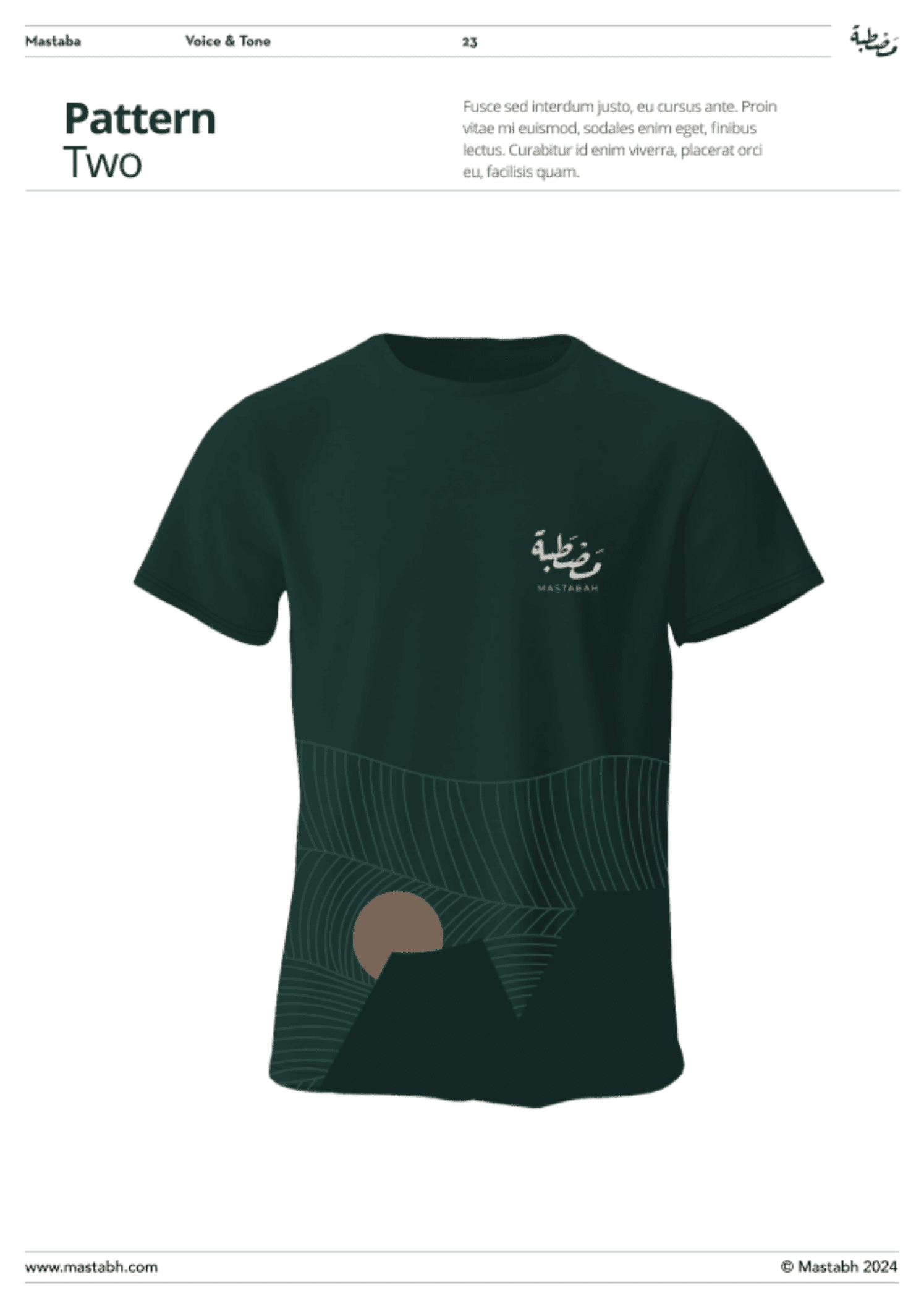
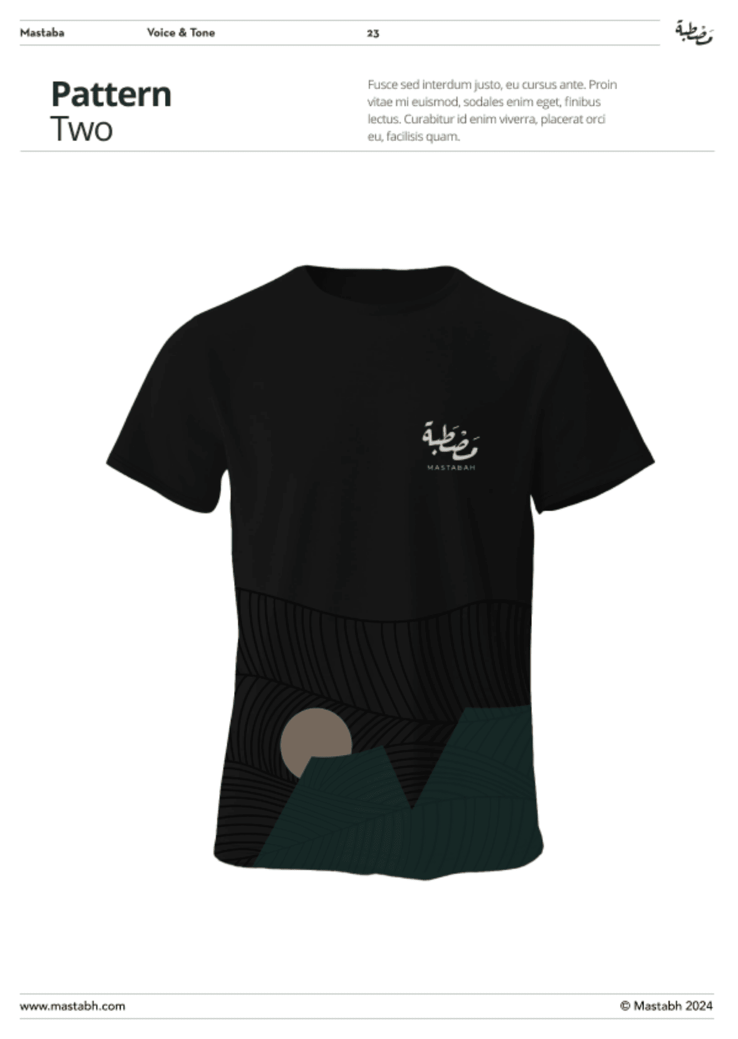
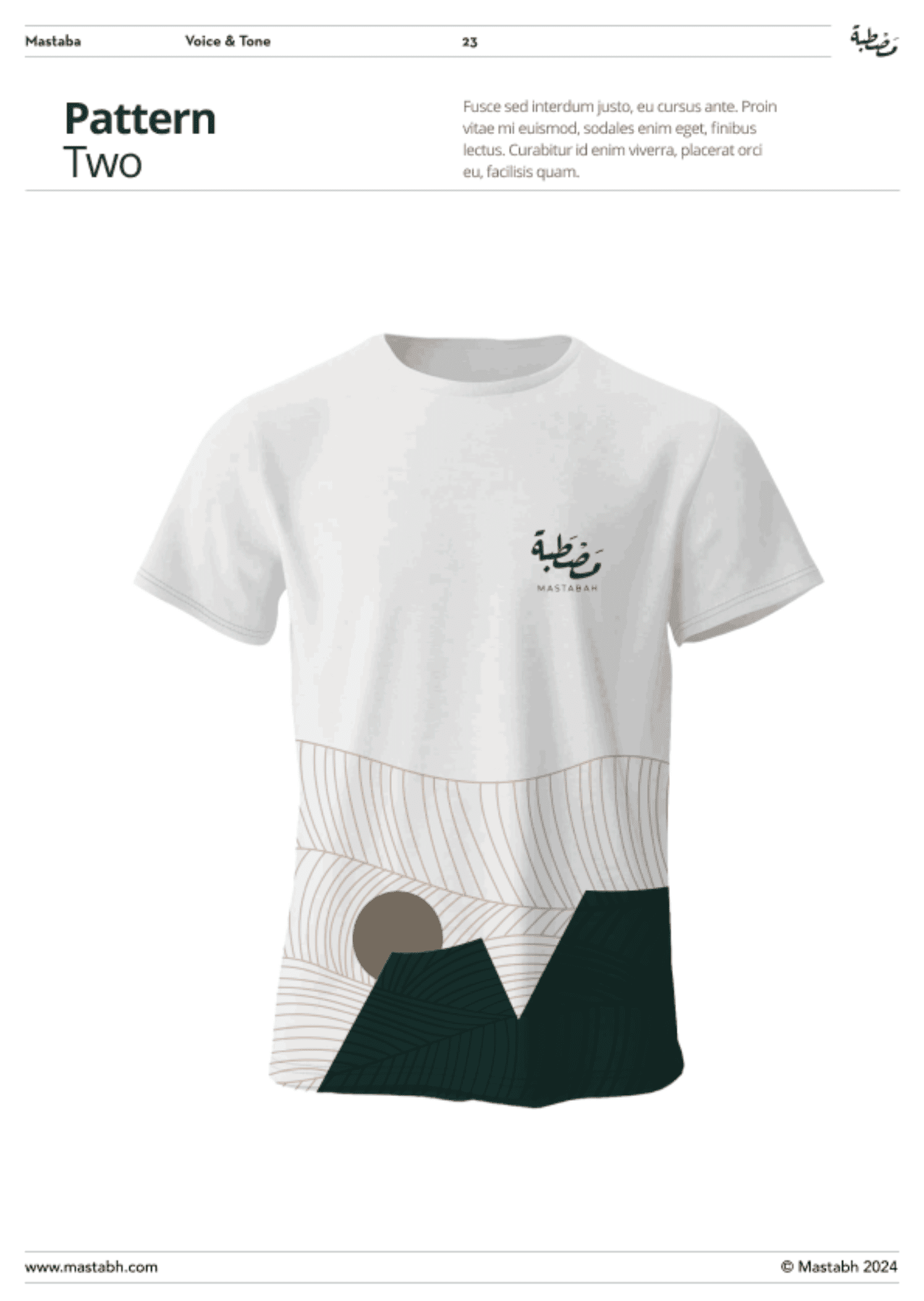
Pattern System: “Brand texture” without extra cost
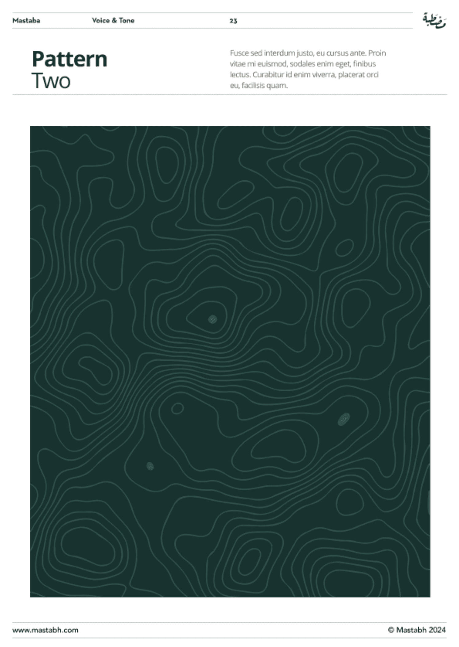
Why it matters:
Patterns are a scalability tool. They give you a recognizable background language for:
- packaging back panels
- social templates
- posters and story highlights
Real-world scenario:
When you don’t have a photoshoot ready, pattern + strong type keeps the brand consistent without looking empty or random.
Photography Direction: Stop looking like stock coffee
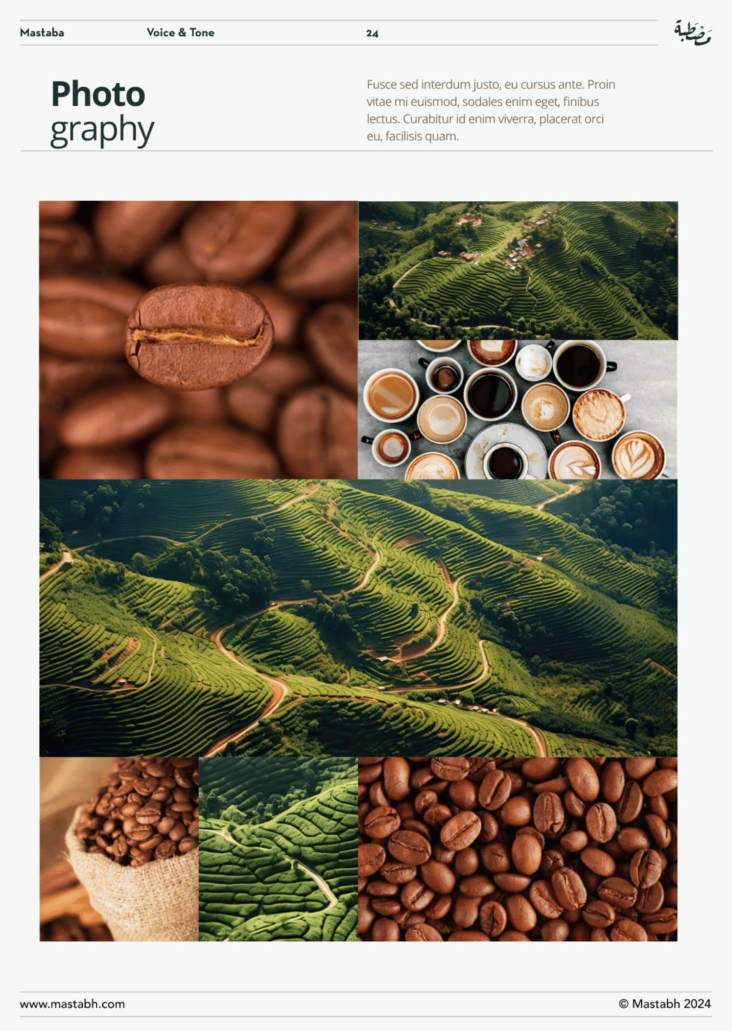
Why it matters:
Coffee is sensory. Photography is proof.
When visuals look generic, the brand looks generic.
Mastabah approach:
We defined a visual direction that’s:
- real moments (ritual, brewing, texture)
- controlled warmth
- minimal backgrounds
- specialty cues (not “mass-market coffee vibes”)
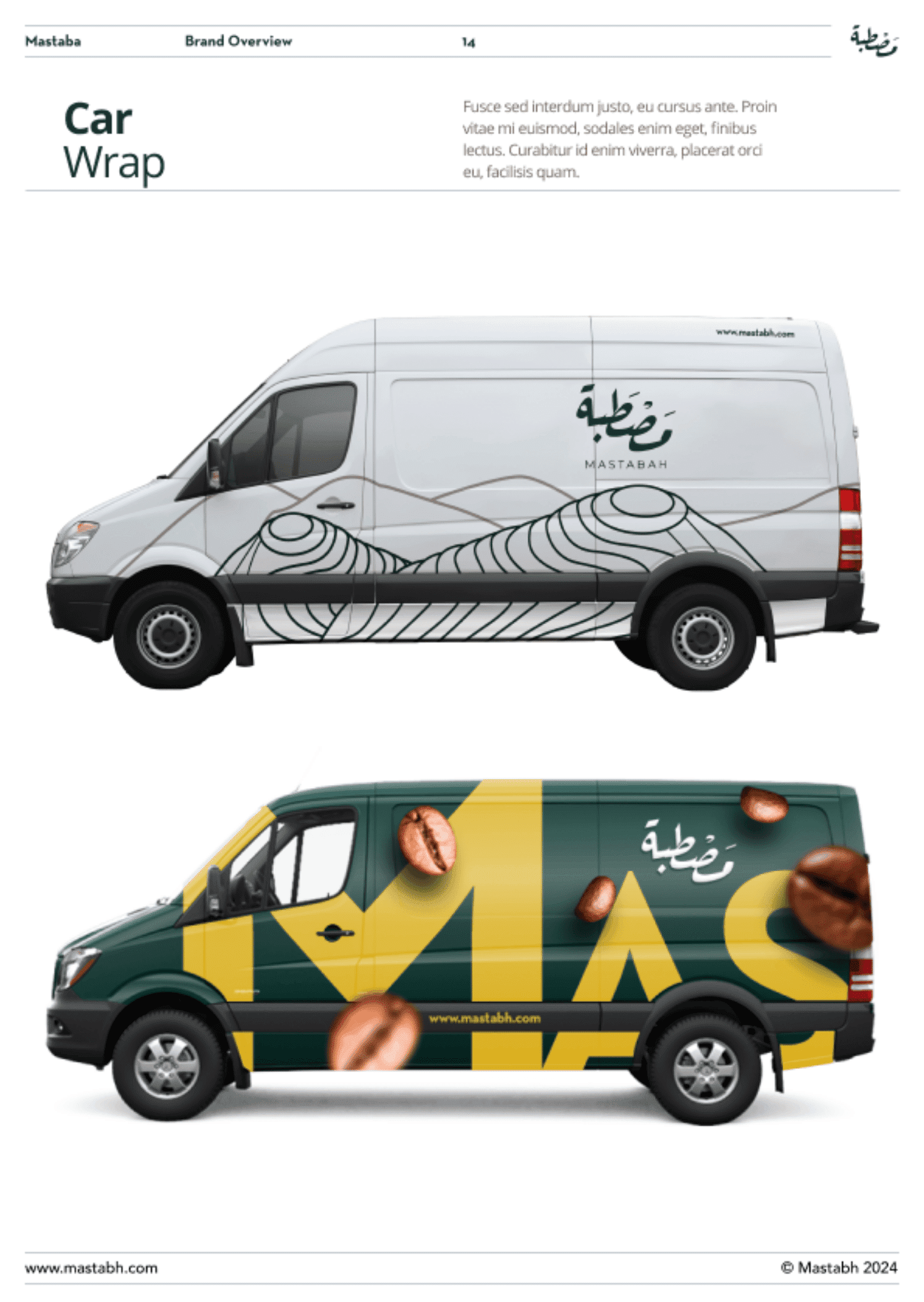
Brand Collateral: Business cards, letterheads, emails (the “quiet deal-makers”)
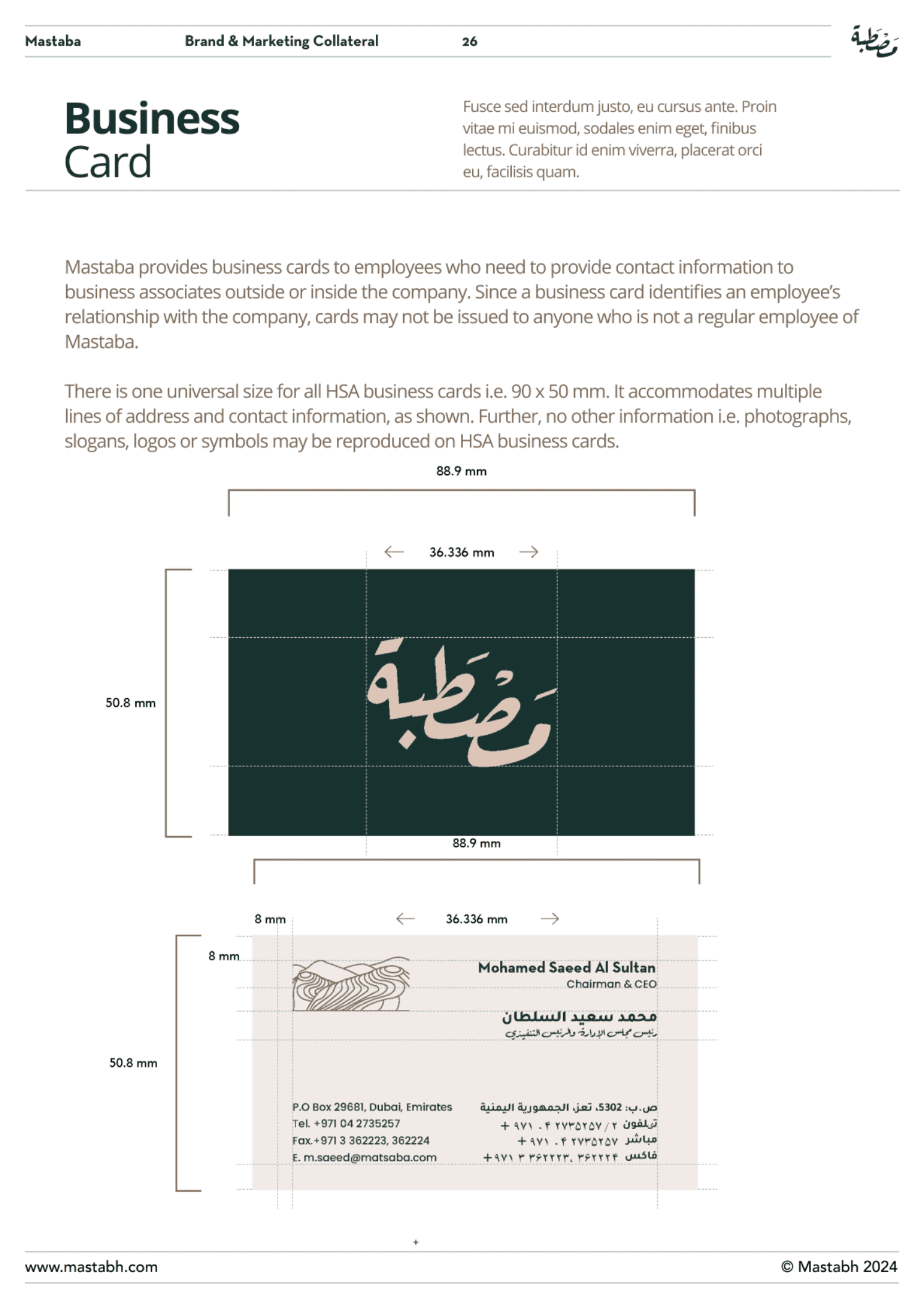
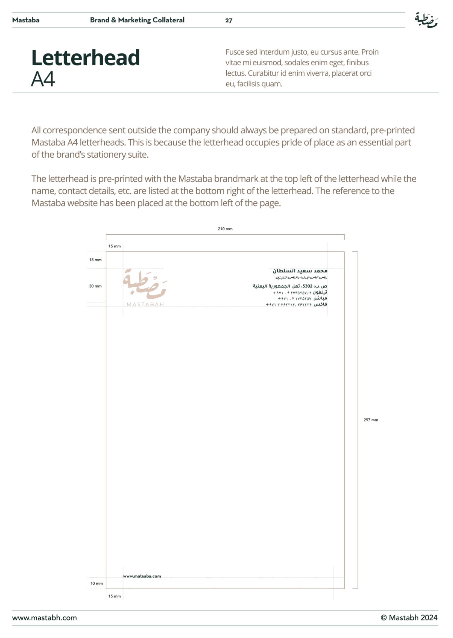
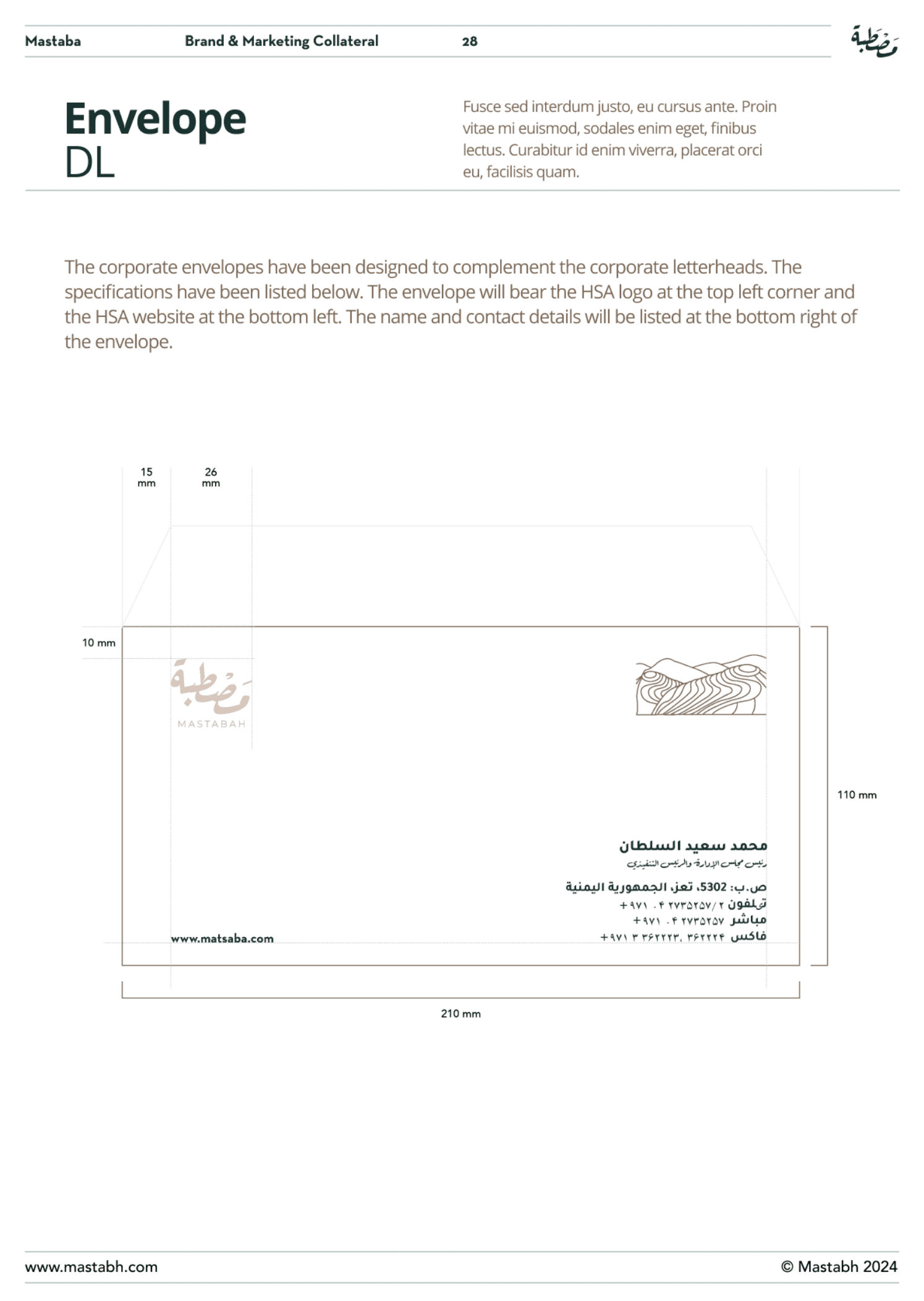
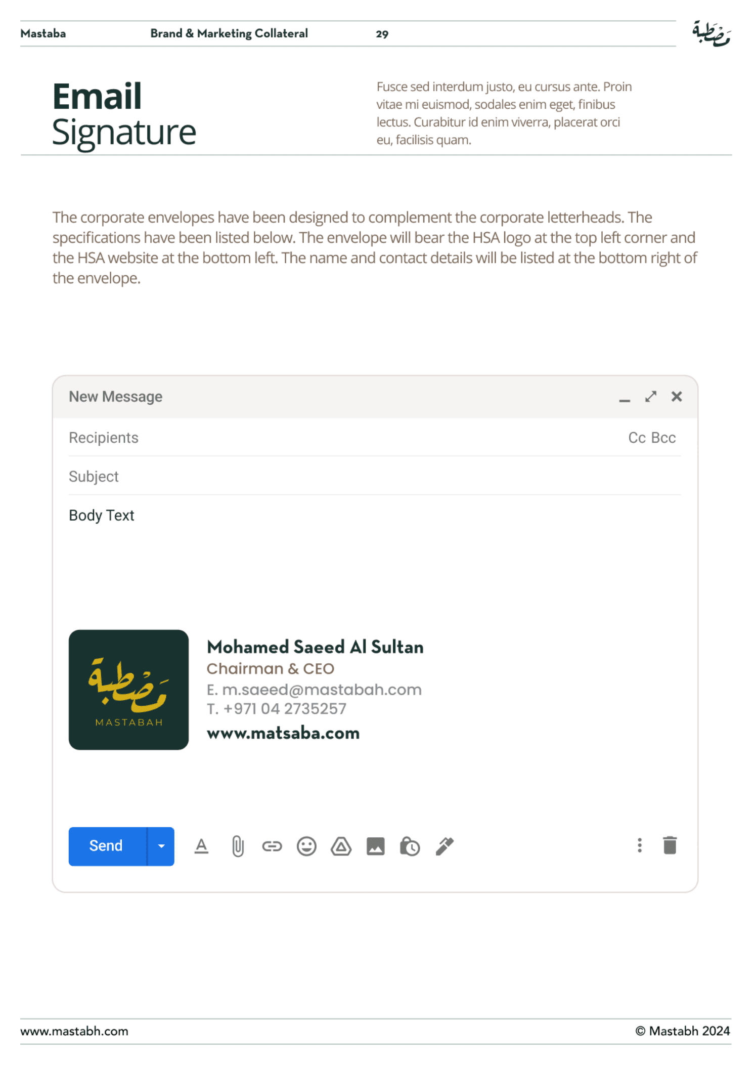
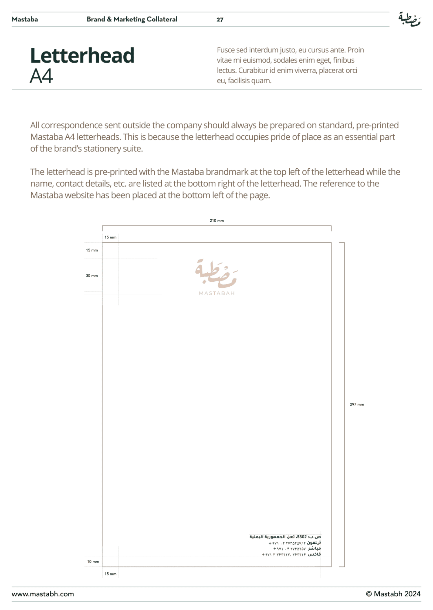
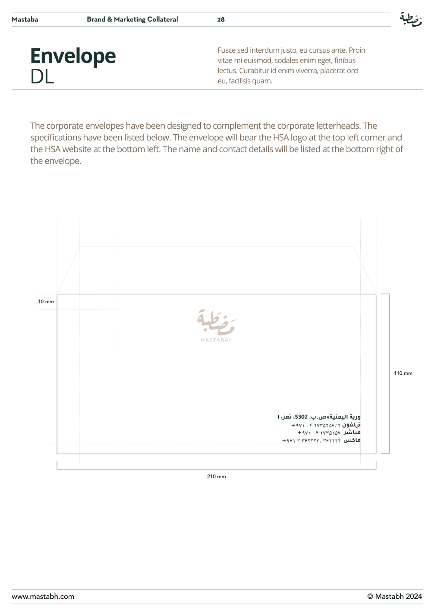
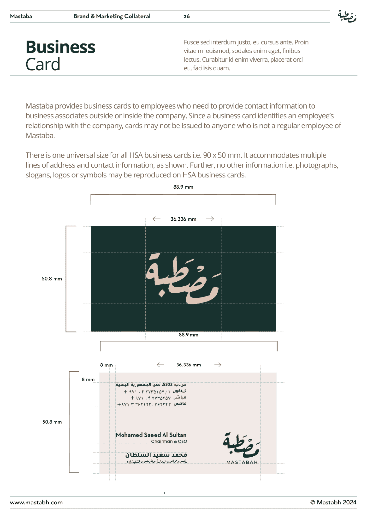
Why it matters:
Premium brands win in small moments:
- a wholesale proposal PDF
- a partnership email signature
- a printed invoice or letterhead
These are credibility signals—especially B2B.
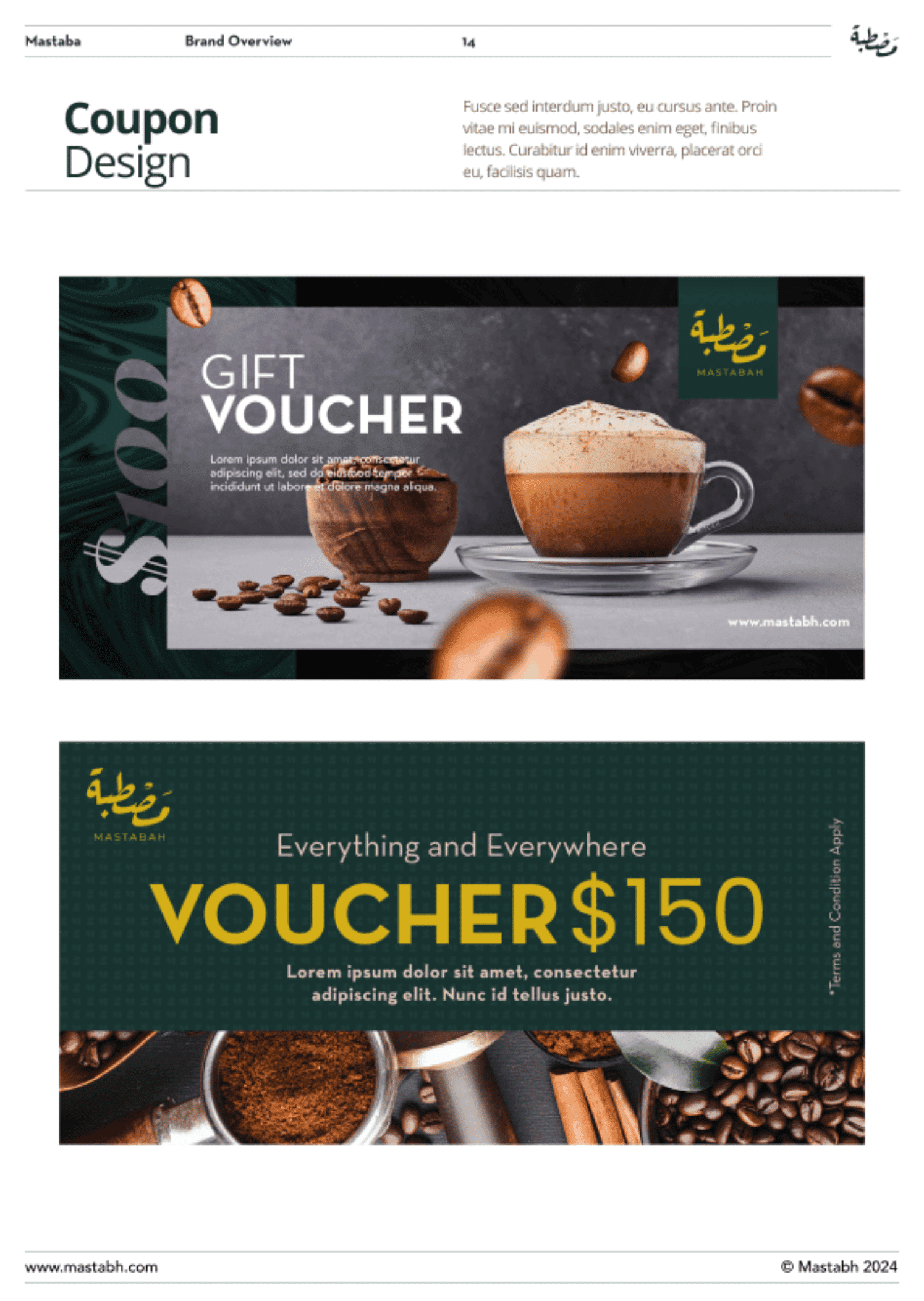
Packaging System (Sticker-led): Premium, scalable, cost-efficient
Why it matters:
Coffee packaging isn’t only aesthetics—it carries trust markers:
- roast date / freshness
- origin
- tasting notes
- brew suggestions
Specialty coffee discussions emphasize freshness and packaging strategies (valves, barriers, oxygen control) because it affects customer experience and perceived quality.
Mastabah approach:
We designed a system where:
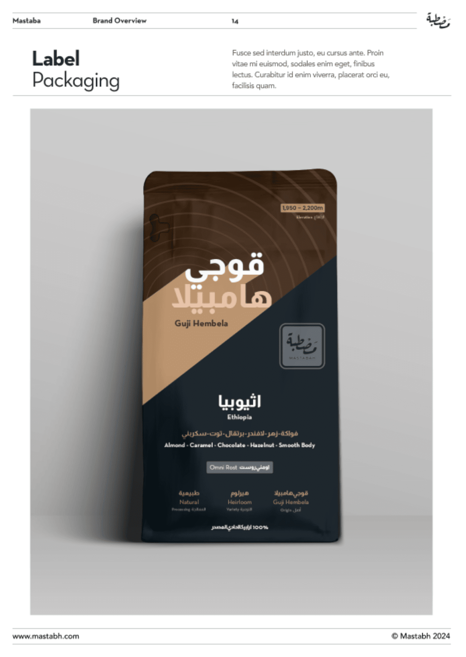
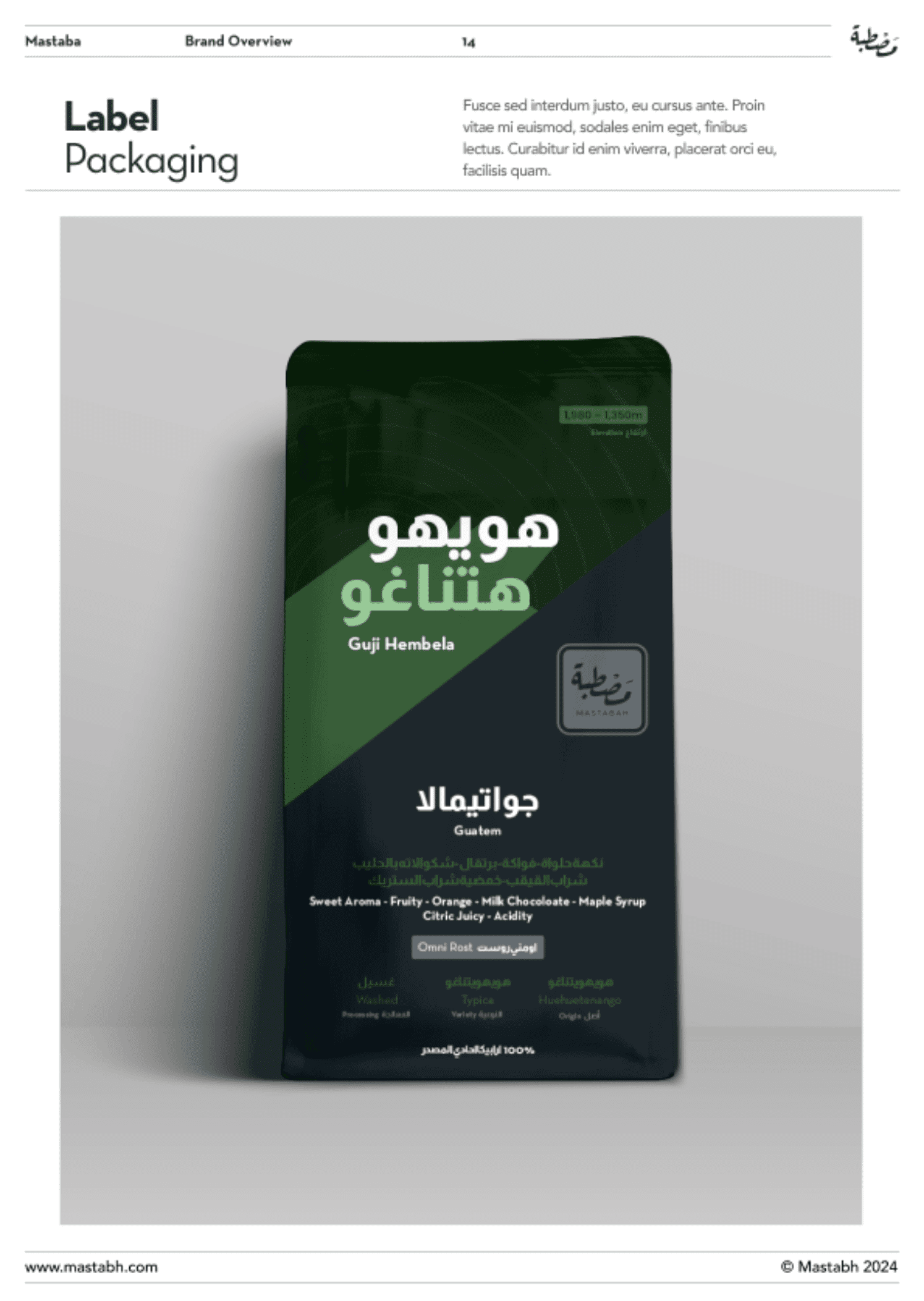
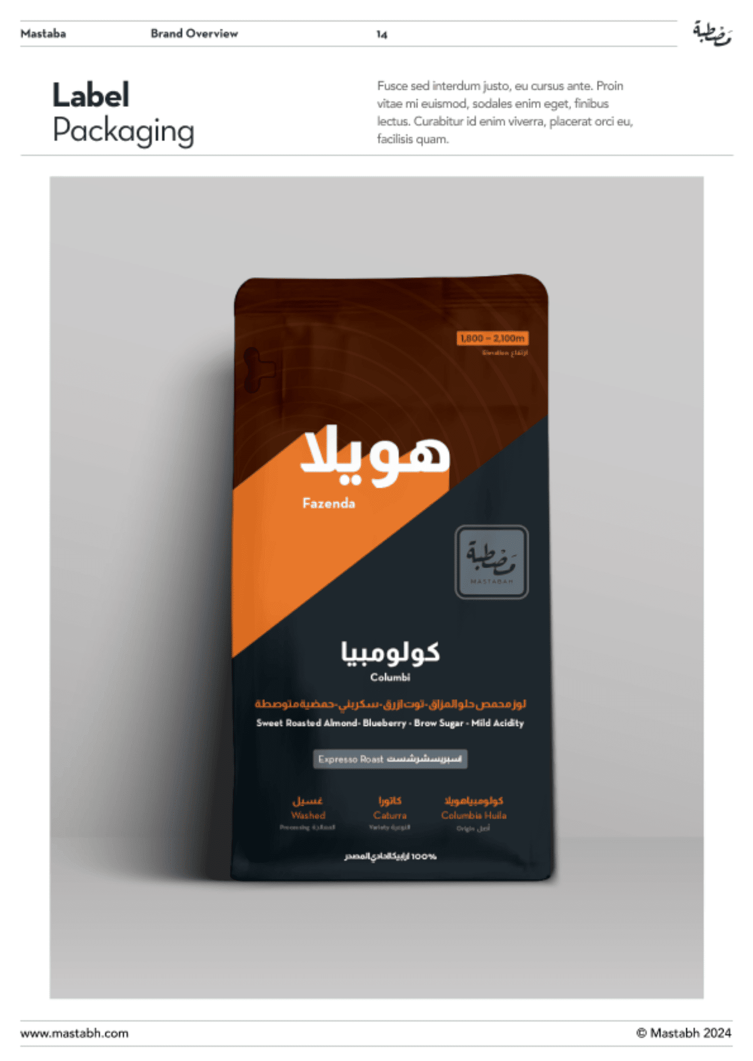
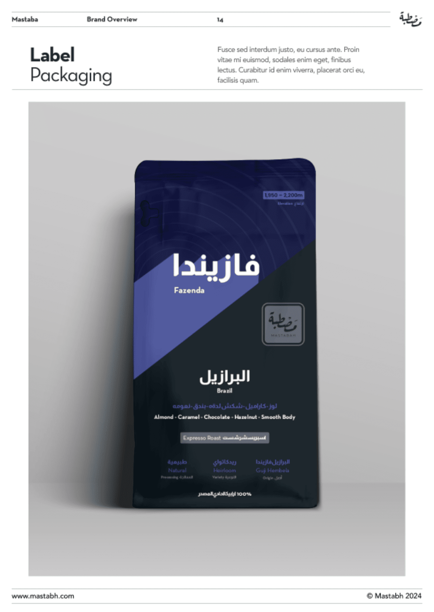
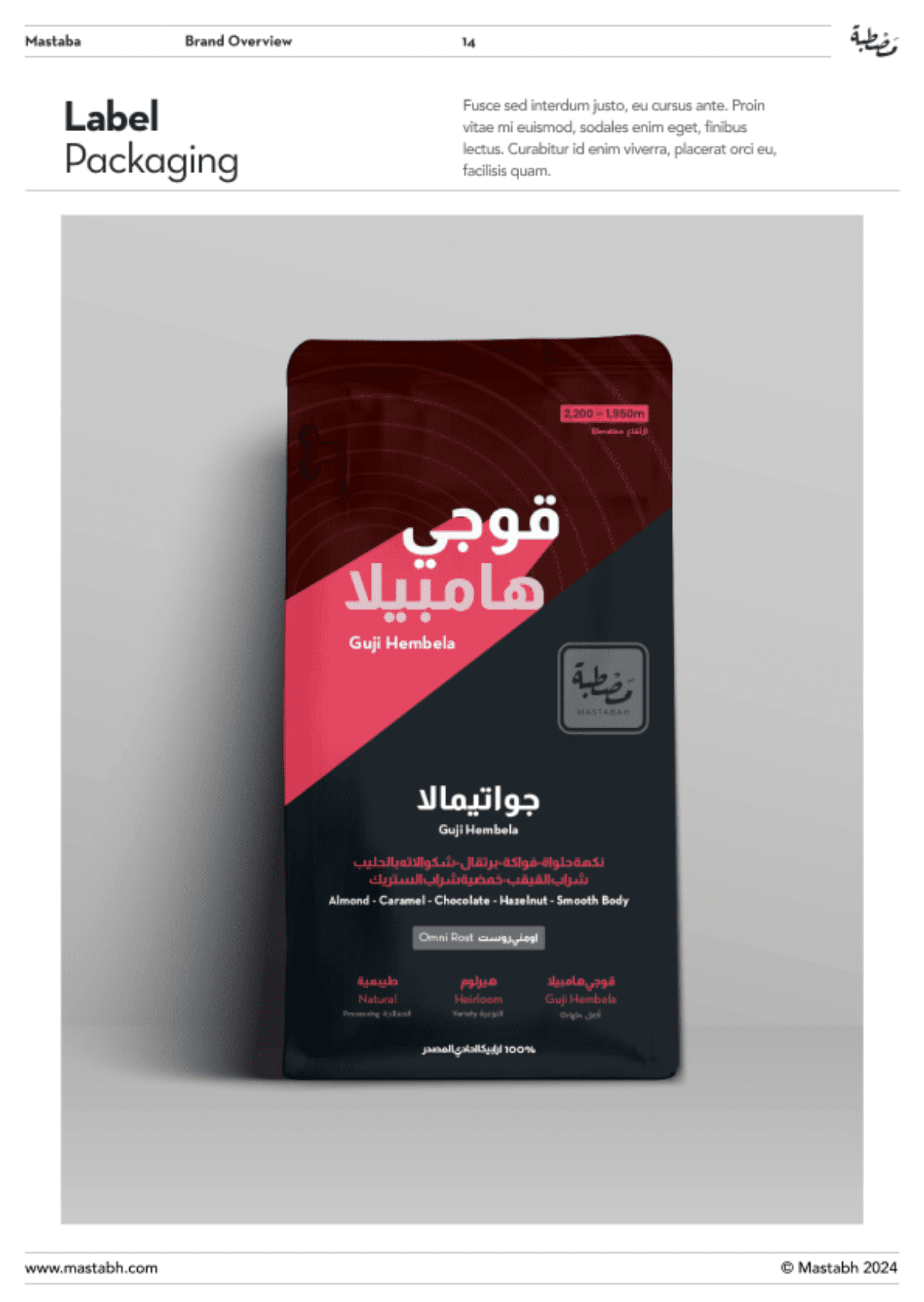
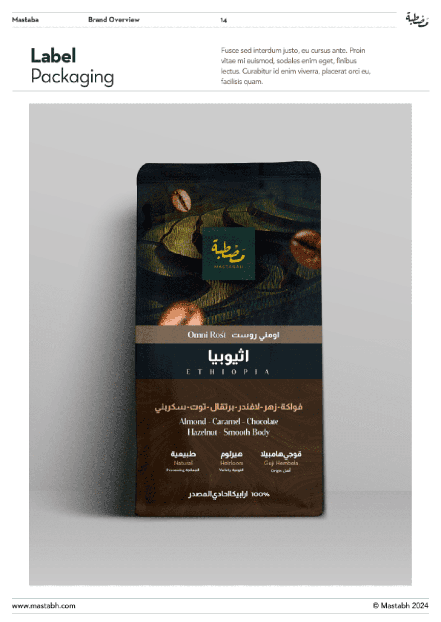
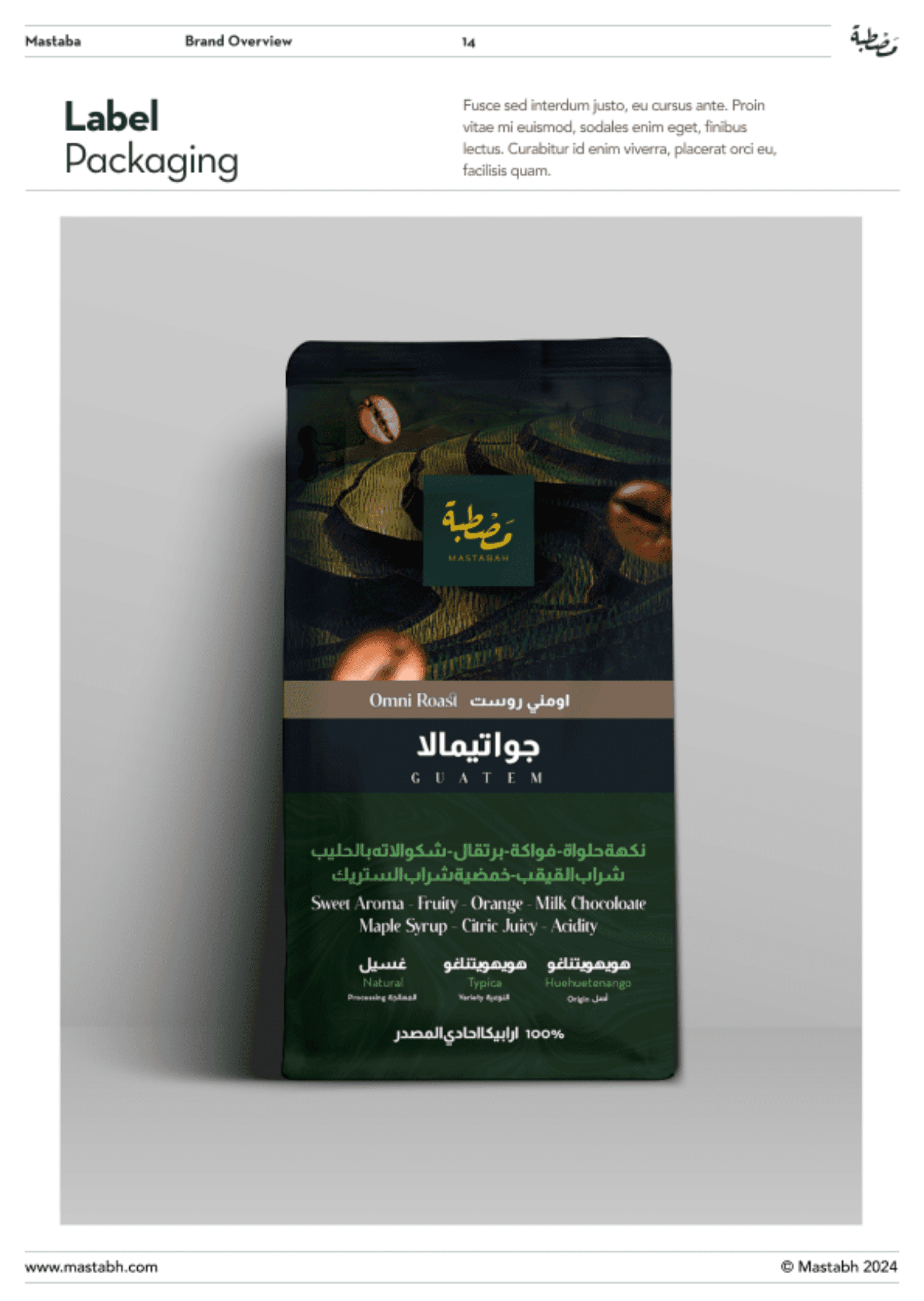
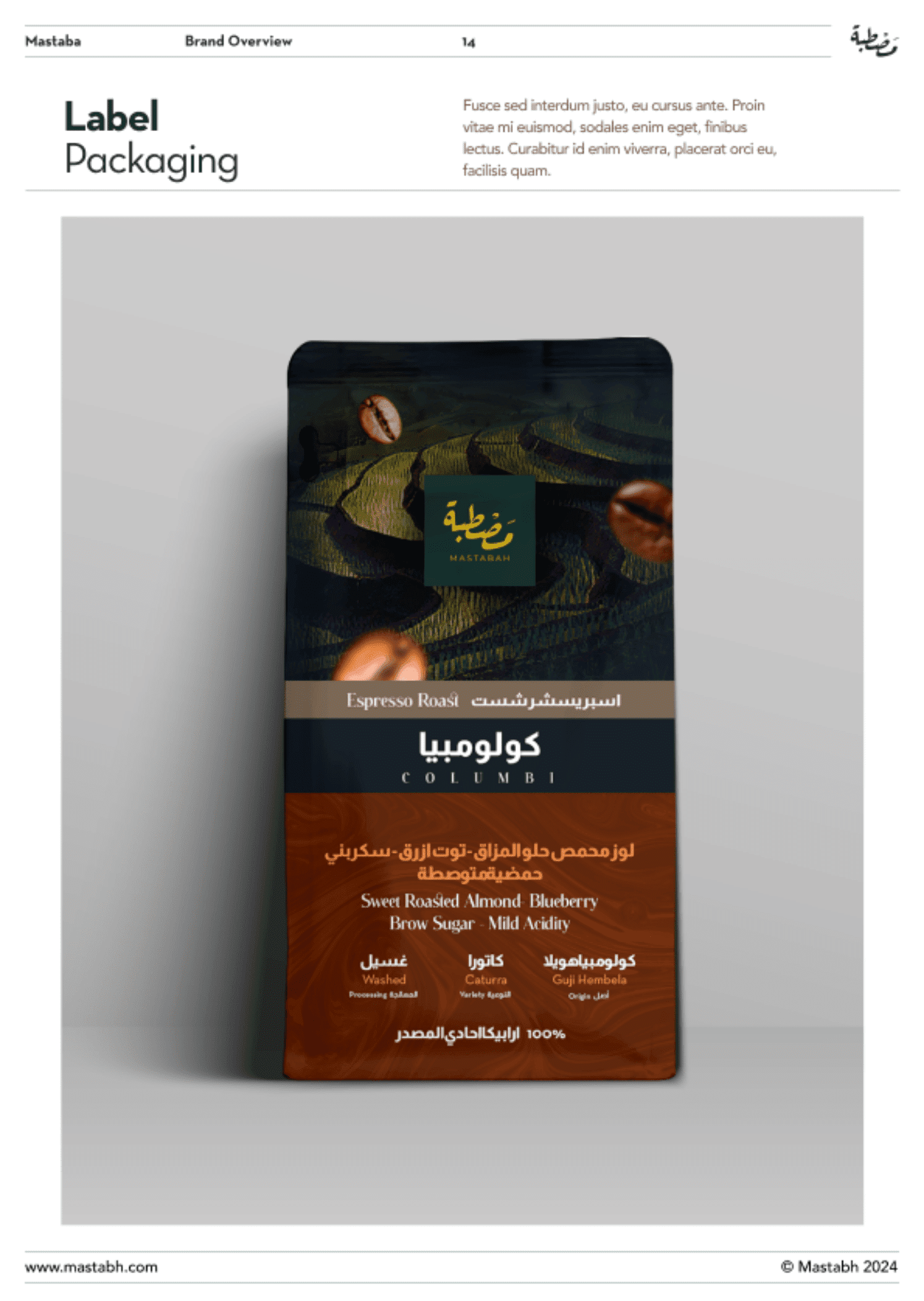
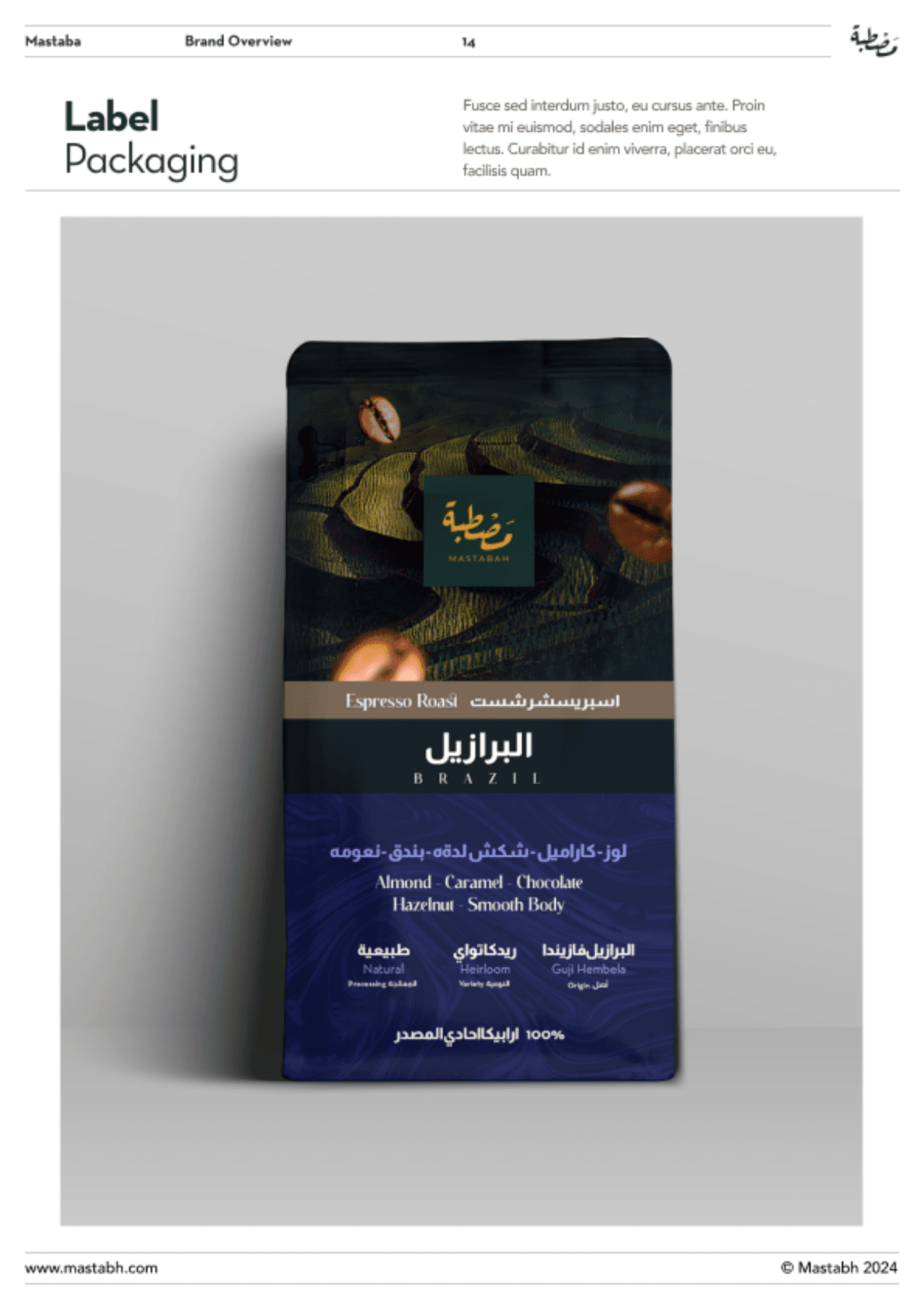
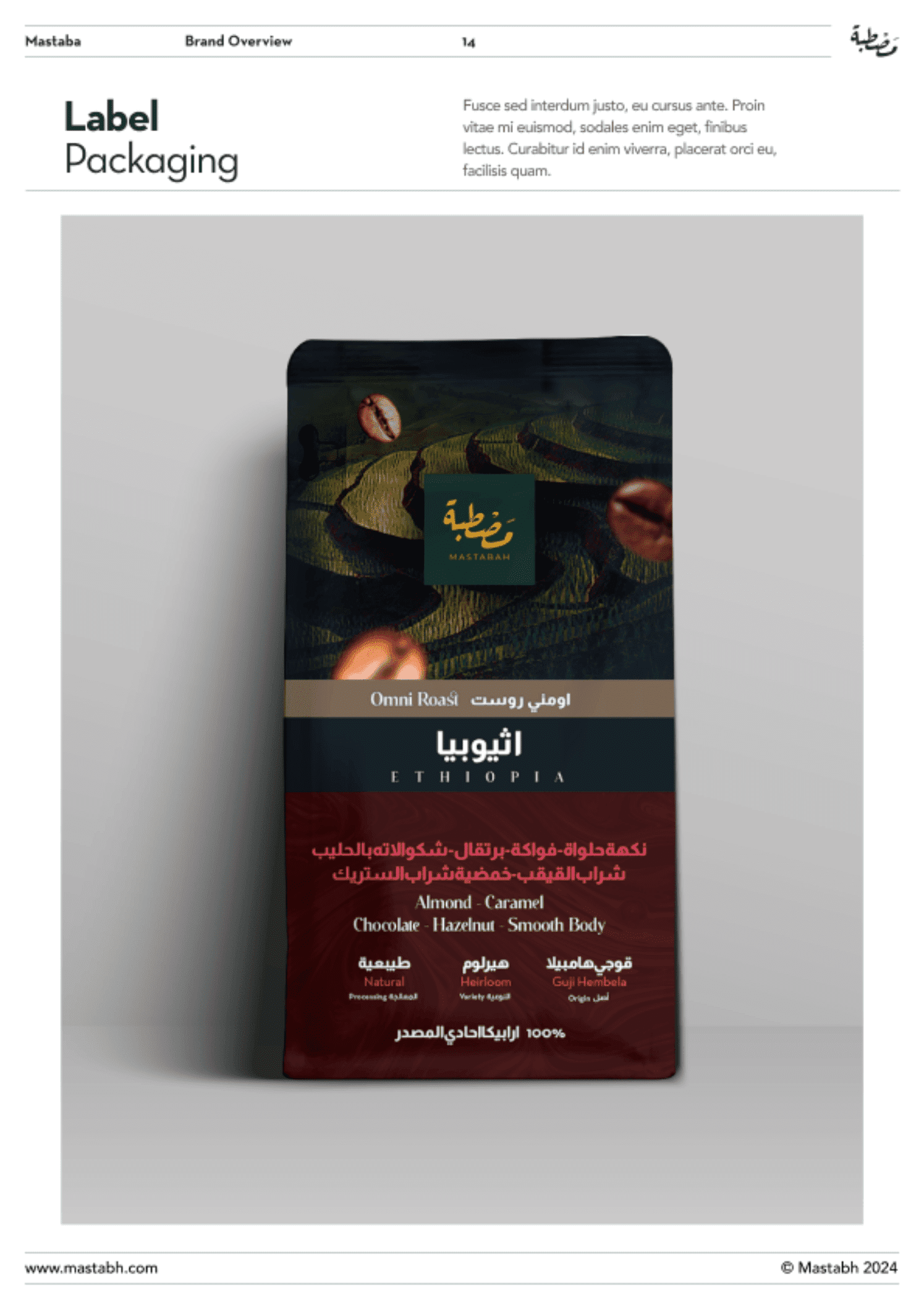
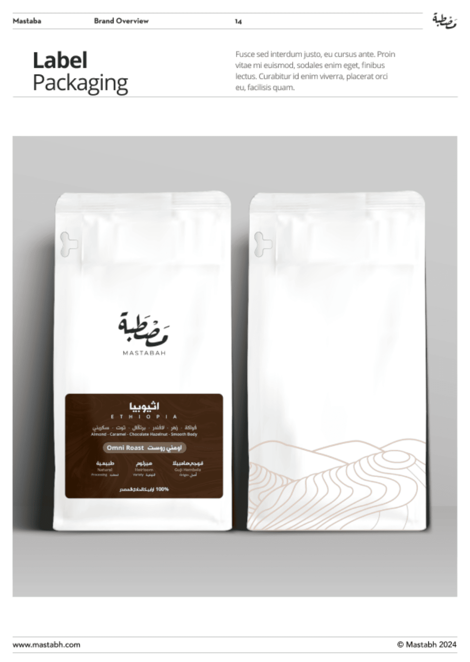
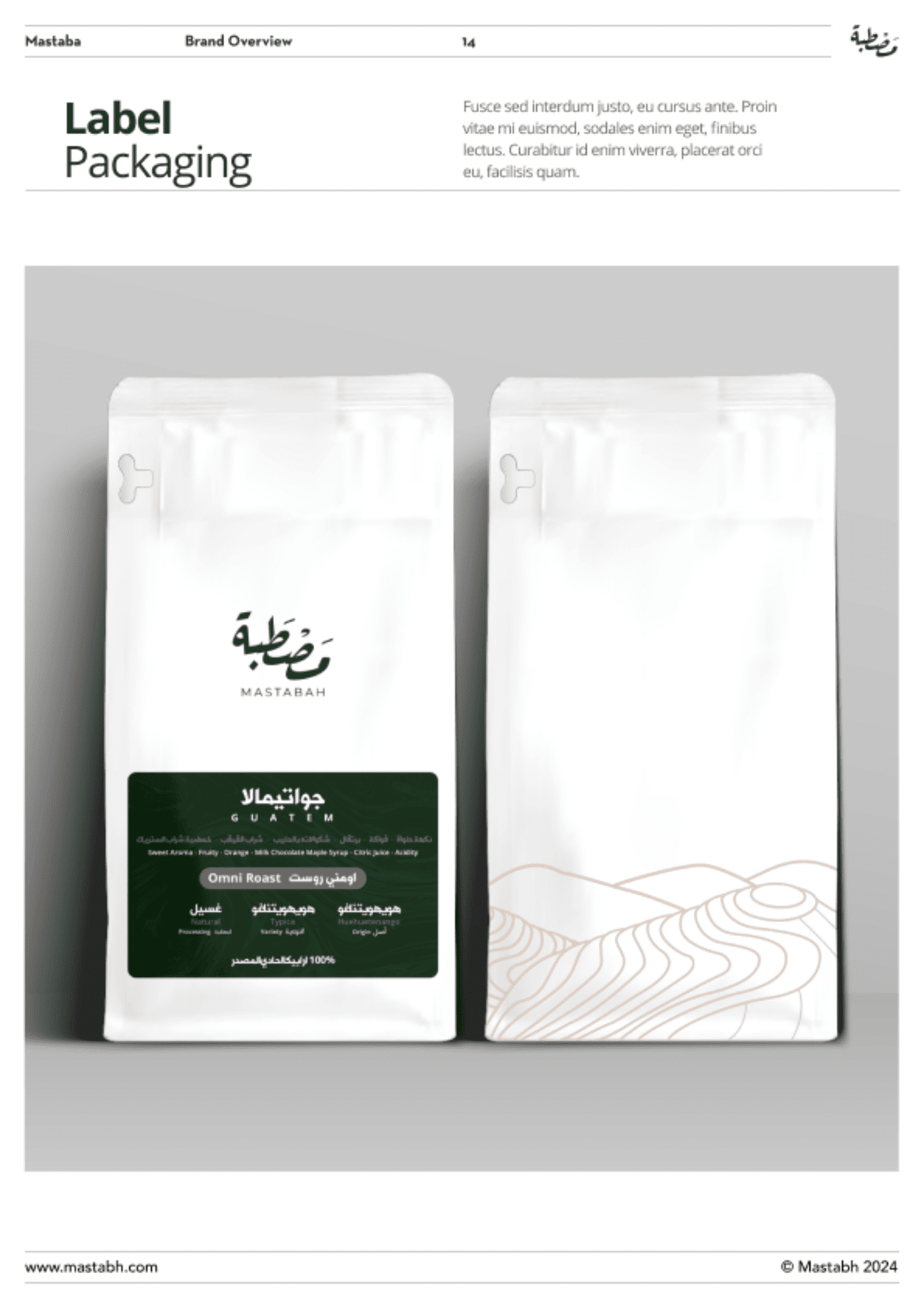

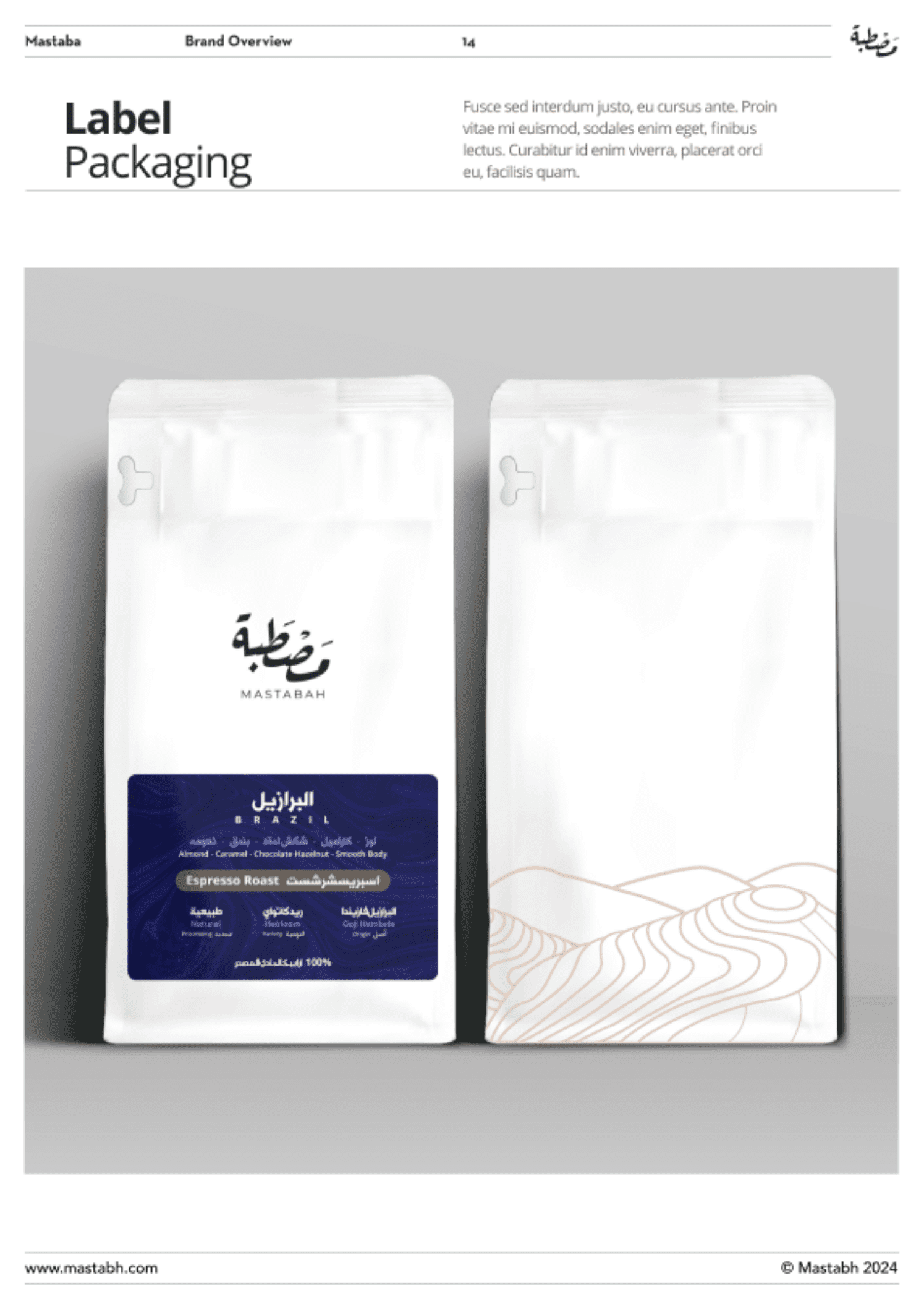
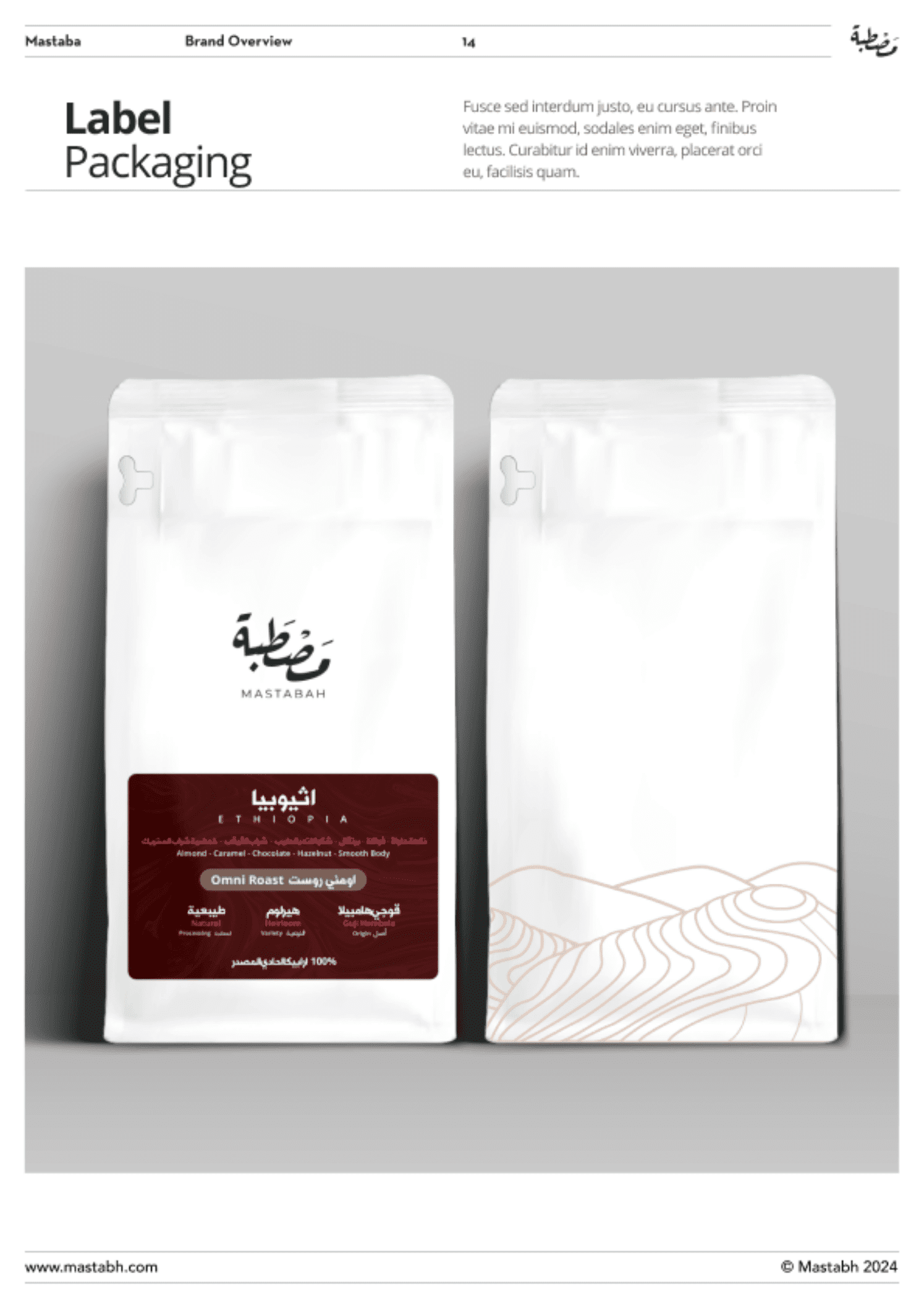
- base packaging stays minimal (production friendly)
- differentiation happens through stickers (SKU scaling)
- label hierarchy stays consistent (so customers understand quickly)
Real-world scenario:
Launching 10 SKUs becomes easy if your packaging system is modular. Without a system, every new product becomes a redesign headache.
Customer Experience Guidelines: The brand is the experience
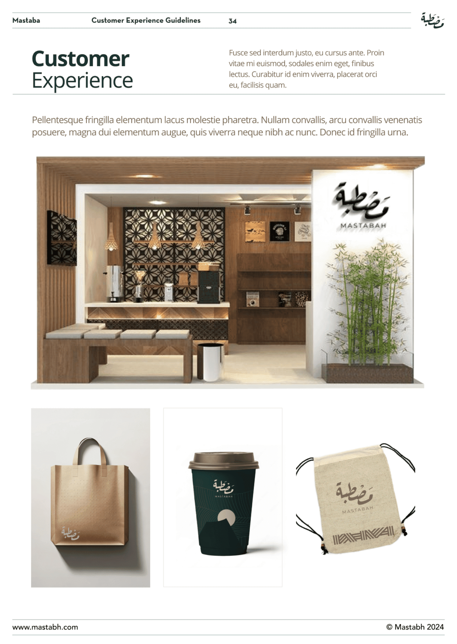
Why it matters:
Brand isn’t what you say—it’s what customers experience repeatedly.
Consistency across visual identity, messaging, and experience is what builds trust.
Mastabah approach:
We translated “calm premium” into touchpoint behavior:
- how you describe products
- how you reply to customers
- how the unboxing feels
- how the brand behaves when something goes wrong
The Business Result: Why Brand Guidelines Pay for Themselves
Brand guidelines are not “a nice-to-have PDF.”
They reduce:
- off-brand content
- execution confusion
- revision cycles
- inconsistent vendor output
And they increase:
- speed of content production
- trust perception
- consistency at scale
Multiple surveys and industry reporting around brand consistency highlight how common off-brand content is inside organizations—and why guidelines matter operationally.
If you want this for your coffee brand
If you’re scaling SKUs, expanding channels, or simply want your brand to feel premium and consistent everywhere, you don’t need “more designs.”
You need a system.
That’s what we built for Mastabah Coffee: a corporate identity that works on posters, packaging, social, stationery, and customer experience—without brand drift.
